Friday, 24 December 2010

Going mobile, one small step at a time

Earlier in the year I wrote a post on Mobile browser trends into 2010, where I looked at how traffic from mobile devices had be steadily rising from around a thousand visits per month in April 2009, to seven thousand visits per month in April 2010.

I hadn't been paying too much attention to these figures lately, but I was quite shocked to see that mobile traffic had rocketed up to twenty thousand visits per month. Perhaps a bigger shock was that this increase had been much less gradual than over the previous year. Growth had remained steady until September this year, but then the start of the new academic year saw a doubling of visits - hello to our new intake of smartphone-carrying students.

Smartphone traffic to york.ac.uk, 24 December 2009 to 24 December 2010. The huge leap is the start of the new academic year
So will 2011 be the year that we start to make some headway into the mobile world? Hopefully we can make some time alongside the other projects that we've committed to for next year.

Making our blog mobile-friendly

How the blog now appears on an iPhone
My actual reason for writing this post, before I got distracted by looking at graphs, was to say that this blog now has a mobile enabled template, so should be much easier to read on a smaller screen.

(Aside - if you're a blogger user, this is really simple to enable for your own blog. See New mobile templates for reading on the go - Blogger in draft.)

While we may not have a mobile version of the university website for the twenty thousand people who look at it each month on their mobile, the small band of followers of this blog can now enjoy a better mobile reading experience.

Merry Christmas everybody!

Wednesday, 22 December 2010

Facebook's community page muddle

Facebook recently changed how user profiles are presented. They now include neat little links, including to the University you work for or study at. This seems like a nice enough feature on the surface, but Facebook have really botched the implementation.


One would reasonably expect that if an official page sharing the name of your employer or university exists that it would be the page Facebook would link to. That's what happened for me, and I thought "Great, lots more traffic to our page and maybe some more 'likes' :)".

But, unfortunately, Facebook doesn't always link to our official page. Indeed, it usually doesn't. Instead, Facebook often creates a link to one of the vast number of 'Community' pages that it has automatically created. There are so many that I gave up counting them. These pages pull in combinations of Wikipedia content about the University, posts from other University pages and even public posts by ordinary Facebook users that mention the University. I'd probably quite like some of that functionality for our official page, but nope, we just get lots and lots of duplicate pages to confuse users - thanks Facebook!

Most of these Community Pages only have a few 'likes', but some are into the low hundreds. These 'like' counts will surely climb as users follow the links from profiles. We can 'claim ownership' of some of the Community Pages, but there are no docs about what happens if we do and Facebook's support forums feature folk nervous about pressing the button in case it impacts a pre-existing official page. Facebook apparently used to provide a 'Suggest the official page' option on Community Pages, but it's no longer there (it was mentioned in a couple of blog posts when community pages launched). So as far as I can tell, there's nothing we can do.

So, if there's nothing we can do, what's the point of this post? I guess I've several vague goals:
  1. To highlight that if you want to 'Like' us on Facebook then be sure to do so on our official University of York page (if your profile has auto-linked to something else, I don't think there's an easy way to fix that unfortunately - the only workaround I've seen is a bit geeky)
  2. To contribute to a groundswell of dissatisfaction being expressed by page owners everywhere. Facebook have done none of us any favours with this and hopefully will soon fix it.
  3. On the offchance that I've missed something and anyone in our small band of readers can help, to say we'd love to hear of a way to fix this ourselves - please get in touch if you've any tips!

Thursday, 9 December 2010

It's that time of year again

The run-up to Christmas can only mean one thing: advent themed blogs about web design and development! Here are some of the ones I'll be following this year:

24 ways 
Christmas wouldn't be the same without "the advent calendar for web geeks", which has been running since 2005.

The 12 Days of JISC Digital Media Christmas 
A set of quick tips that'll help you to up the quality of any video and audio you produce. Looks like it'll come in handy for people like us who are making some tentative steps into the world of video production.

HTML5 Adventure calendar
"24 days of killer demos, tutorials, community buzz, and other stuff that Steve Jobs would love". Lots of flashy demos that showcase some of the amazing things that can be done with HTML5 right now.

25 days of blog posts from Web Services at Edge Hill University
Once again I'm impressed that the folk at Edge Hill can pull off a post a day about what they're working on - more than one a month is impressive for me!

Monday, 6 December 2010

A new look homepage, coming soon

Over the past few months we've been looking at ways of improving the University homepage.

We're finally at the stage where it's ready to be revealed, so without further ado, here's how it's looking (click the image for a full size version):


What's changed?

A better overview of what's going on

One of the key aims of the redesign was to make the homepage a lot more lively and do a better job of representing the diverse range of activity going on throughout the University. Apart from the news items which changed every few days, most of the old homepage was static, staying the same for long periods of time. We wanted that to change, so that repeat visitors to the page (both internal and external) would get to see something different each time, showing them various aspects of university life.

Instead of showing a large random image, there's now a dedicated space for showcasing big research discoveries, high profile speakers coming to campus, achievements, campus expansion news, etc - anything that shows what a great place York is to study or work.

In the old design, we could just about cope with one of these features at a time, but the page became very cluttered when we had several of them:


We're now using a sliding interface to allow us to have multiple features at the same time. This is something that we've been doing on departmental sites for a while (eg see the Computer Science homepage) - but is new to the homepage.

Keeping it up-to-date

Having such a high profile space for featured content means that we'll have to make sure that there's always something new to put up there.

One of the first things that we've done is to set up a homepage editorial group, with representation from the press, publications, events and web teams. The job of this group will be to identify stories that could be featured on the homepage, and to also find / produce content that we can link to from the homepage.

Getting input from people across the whole University is going to be absolutely key to this, so keep an eye out for further messages.

Clearer paths to major areas of the site

The major sections of the site are now all together in a horizontal navigation bar across the top. The 'directory listing' type parts of the site (A-Z, departments, contacts, jobs, etc) are all grouped together, near the search box.

Simplified colour palette

We've moved away from the rainbow of blue, purple, orange and green, and are now using our corporate green. This brings the homepage in line with the other top-level parts of the site which have already moved into the Web CMS, such as About the University, Research and Campus development.

Links to social networks

A lot of online activity these days goes on beyond the limits of our website, particularly in places like Facebook and Twitter. There's now a link from the homepage to a new directory of social media activity, listing our main corporate presences and the ones maintained by individual departments and offices.

A first step, not the end of a process

We know that not everyone who uses the University website sees the homepage - just under half of our visitors never encounter it (usually having arrived at a lower level part of the site via a search engine). We need to continue to make improvements that will improve the experience of all of our visitors, no matter where they begin their journey.

One key piece of work is that we've started working with Student Recruitment and Admissions on making some big changes to our central student recruitment pages.

Launch date

We're planning on launching the new homepage next week, on Monday 13 December 2010.

If you have any questions or comments, please email them to web-office@york.ac.uk, or leave a comment below.

Monday, 22 November 2010

Tuesday, 16 November 2010

Accidentally building an audience on Facebook

It's almost exactly three years since I set up the University's Facebook Page, as part of the landgrab when 'Pages' were first introduced. Since then we've done very little with the page other than keeping it ticking over. I've kept a slow trickle of updates flowing into our stream, usually press releases or public lecture listings, but very little else.

Given the lack of effort expended, it's been to a bit of a surprise to realise of late that our Facebook Page has become rather popular. We're approaching 6000 'likes'. We've almost trebled our number of 'likes' in 12 months, with a big spike when A-level results came out but continuing to grow at 50 - 80 new ones per week (see images below). This is especially impressive given that we've never posted a link on the homepage or main student pages of the website.


Our levels of interaction are relatively low; we get tiny numbers of 'likes' or comments on most posts and almost no questions on our wall, though we do very little to encourage any. But last night when I posted an update about our presence on University Challenge we picked up half a dozen comments and 45+ 'likes' within the hour. We also know that we get a small spike in traffic to stories on the website or videos on YouTube when we post them on Facebook. In short, it's clear that there's an audience out there and that it's comprised of people who, having sought us out, are interested in what we have to say (especially when we say something interesting!)

The ambition of Facebook's expansion - the changes to Messages announced yesterday, the Foursquare-style checkins, the open graph Facebook-isation of the whole Web and persistent rumours about ventures into search and mobile - mean users may well soon be spending even more time in Facebook. For the forseeable future we'll be continuing with our light touch approach, but as Facebook grows and our audience on Facebook grows too, we may find that we've accidentally grown a valuable communications channel deserving of much more attention.

Related info: For anyone wondering if their department or office should be on Facebook (or Twitter, or LinkedIn etc.), we're producing some guidelines to help you decide and to help you do it well if you do take the plunge. These aren't quite ready yet, but they're coming (better late than never!) In the meantime, feel free to contact us for individual help and advice.

Monday, 8 November 2010

Learning about accessibility

The web design and development education site Think Vitamin Membership have recently done something rather nice by making their whole series of accessibility videos available for free (you normally have to pay to view their videos).

The series starts with the absolute basics of what accessibility is and how different disabilities can impact a person's use of the web, and goes on to cover more advanced topics such as how to make dynamic web applications accessible, so there's something there for people of all experience levels. Even if you already know a bit about accessibility, these videos are a handy reminder.


Tuesday, 2 November 2010

Encouraging students to explore their campus - Foursquare for universities


I somehow missed this when it was launched back in September (probably because I was up a mountain in Peru, far away from the internet). The location-based social network Foursquare now offers a service specifically for higher education, with its Foursquare for universities programme.

The more playful side of it is the set of five badges for universities, including Campus Explorer for people who check-in at more than 10 locations on campus, and Campus Munchies for checking-in at five dining rooms on campus.

A more practical application of this could be the use of tips to provide helpful bits of information about campus landmarks, lecture halls, sports facilities, accommodation, catering facilities, etc. This could be really useful especially for potential students on open days and new students finding their way around at the start of term.

You also get the ability to define your own special offers - you could for example give discounts to the people who most frequently check-in to campus cafes and bars, which could work as an incentive to eat there rather than going off campus.

Via Mobile in Higher Ed

Thursday, 28 October 2010

Site maps of days gone by

Remember the good old days, when a site map of an entire university website could fit on an A3 page?


This is from a leaflet I found entitled "A guide to YorkWeb - the University's site on the World Wide Web". I'm not sure exactly when it's from, but the other side includes instructions for connecting to Windows 3.1, so it's a fair few years old*.

* Although, we did only recently move to the cutting edge of Windows XP, so it might not be quite as old as it looks :)

Graduation goes live


The new pages for Graduation went live on 25 October.
The new pages have been restructured to make it easier to find key content, such as booking gowns.
Although this is a quiet time of year, as ceremonies take place in January and July, our Graduation pages still get several hundred page views a day. We are pleased to have moved such high profile content into the Web CMS.

Wednesday, 20 October 2010

New website for CREMS


The redevelopment of the website for the Centre for Renaissance and Early Modern Studies went live earlier this week, powered by the web CMS.

Before:

After:


Thursday, 14 October 2010

Thursday, 30 September 2010

Language and Linguistics goes live


The Department of Language and Linguistics has just gone live within the Web CMS.
The Department hosts a series of research papers, York Papers in Linguistics, which are not changing in design but have a new url.

Wednesday, 8 September 2010

New Centre for Immunology and Infection website

A new website for the Centre for Immunology and Infection has gone live today, powered by the Web CMS. The site is live in time for the Centre's inauguration of their new research building which takes place on Friday.

Before:

After:

Thursday, 26 August 2010

CMS rollout - 18 months in

Almost exactly 18 months ago the University Library was the first Web CMS-managed site to go live. We’ve come a long way since then, so here’s a quick list of the sites currently powered by Site Manager:

And of course there are many more to come...

Wednesday, 11 August 2010

Exhibition knives and homepages

During my recent attendance at the IWMW conference in Sheffield, we paid a visit to the Kelham Island Industrial Museum and I spotted the Exhibition Knife pictured below.

As Paul noted when he posted the now infamous XKCD homepage strip, we’re currently planning some homepage changes. I thought the 365-blade knife was a nice metaphor for what a homepage would turn into if everybody with an opinion had their way: a blade for every possible user and every possible task, but all rendered useless by the sheer volume of surrounding alternatives. We’ll try to avoid that trap as we design our new page :)


(Click the image to see a larger version and to appreciate the detail. It’s an impressive piece of craftsmanship, created to showcase the talent and expertise in Sheffield’s manufacturing heyday. Also on display were other Exhibition Year creations, including a yard long saw and an oversized, intricately decorated file).

Friday, 6 August 2010

Zen coding for rapid HTML authoring

Writing HTML is fiddly. All those angle brackets, quotation marks, slashes and the rest have always tested my keyboard dexterity. Dreamweaver and other editors try to help, but none compare to a brilliant new(-ish) multi-editor plugin called Zen Coding.

Instead of writing HTML syntax, Zen Coding lets you write CSS selector-style abbreviations and hit a button to expand them to HTML. It’s lightening quick and lets you write HTML snippets in seconds. Simple additions to the CSS syntax allow for output of multiple tags (eg. li*2 becomes <li></li><li></li>
) and automatic numbering (eg. link-1, link-2). It’ll do even more clever stuff than that too, but I’m still a novice!

A really quick example:

blockquote#boxout>h2+p+ul>li*3>a[href="/link/"]

expands instantly to

<blockquote id="boxout">
<h2></h2>
<p></p>
<ul>
<li><a href="/link/"></a></li>
</ul>
</blockquote>


Filling the empty code with content is easy too because there’s a handy ‘next sensible spot’ keyboard shortcut to skip from the H2 to the P to the LI to the HREF etc.

The one gap for me is that I have to use a text editor to use the Zen Coding expansions. Most of my coding is done in Firebug or within our CMS so I can’t use the expansions directly where the code needs to be. I’ve always got a text editor open so it’s not a big deal, but a Firefox/Chrome extension or integration with a generic text expansion utility (as Paul blogged about previously) would be even more brilliant.

There’s a full tutorial on Smashing Magazine, including the rapid-fire demo video embedded below which shows just how fast it can be and what it’s capable of.

Thursday, 5 August 2010

Educational Studies goes live

The Department of Educational Studies has gone live in the Web CMS.

The move was part of a strategic review of the Department's marketing and positioning, and there are further changes to come.

Sunday, 1 August 2010

Langwith College now live

The new Langwith College website is now live.

The site uses the College colours of yellow and black, and includes photos of the yellow and black window foils along the Langwith-Derwent corridor. These were specially designed for the College and show aspects of College life and special features of Langwith. The College shield has been redrawn and simplified to make it easier to see online.

Langwith is the eighth and final College to go into the Web CMS.

Friday, 30 July 2010

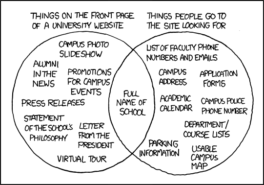
What to put on a university homepage

We're currently looking at making some changes to the University homepage, so today's post from xkcd is rather timely:


Hopefully we'll remember to include the things that people go looking for!

Update

A couple of higher education blogs have gone into more detail on the subject:

Wednesday, 28 July 2010

IT Services goes live

The Computing Service changed its name to IT Services today, and along with the name change they have a brand new website.

The move into the Web CMS prompted a fundamental review of the site's information architecture and content. The site has been completely restructured based on user feedback and usage statistics, and much of it has been rewritten for clarity.

This was followed by a comprehensive programme of pre-launch user testing. This picked up difficulties and ambiguities which made it harder for users to find what they wanted. While some key issues were identified and resolved, it was very good news to discover that most of our testers found information easily and quickly. As one of the University's most high-profile sites - both internal and external - it was really important to get this right.

Do you have a view on the new site? Please fill in the 1-minute user survey and let us know.

Tuesday, 27 July 2010

Derwent College goes live

The new site for Derwent College went live today.


Derwent is strongly focused on student involvement, integration and sociability: the numerous photos on the site, and the 'I love you Derwent' student profiles, illustrate those themes well. There's also a page showing the commemorative garden that's being built for Ron Weir, who sadly died last year after 29 years as Provost.

The College shield has been redrawn for clarity but retains its simplicity and impact.


Derwent is the seventh college to go into the Web CMS.

Friday, 23 July 2010

Can you attend a conference without physically being there? Thoughts on IWMW 2010 as a remote attendee

Dan recently blogged about his experience at IWMW this year, so I thought I'd share my experience of the event as someone who wasn't physically there, but was instead following the action remotely.

Being a conference for web folk, it should come as no surprise that it makes extensive use of technology as a way of amplifying the conference experience. The have been live video streams of the talks as far back as 2007, and "backchannel" discussion on Twitter before most people even knew what Twitter was.

On the first day of the event I fired up the live video stream with the aim of watching the opening session. But then the phone rang, and I missed most of that. And then I got called into a meeting. And then something on the website broke that needed fixing urgently. This was a common theme over the three days of the event - I was able to catch the odd bit of a session here and there, but didn't manage to watch anything all the way through.

In spite of the interruptions, I was dipping into the Twitter stream of posts tagged with #iwmw10 as often as I could, which was giving me a good idea of  the key messages from each of the sessions, and how the physical audience were responding to them. As well as being streamed, videos of the talks have been made available to watch on-demand - now all I need is to find some time to actually watch them.

It's obviously not as good as being there in person - a lot of the benefit of being at a conference comes from the discussions that happen outside of the talks (and usually after a few drinks), and there's that pesky thing called the day job that keeps getting in the way. But in times when not everyone can afford to spend three days out of the office, it's not a bad substitute.

Sunday, 18 July 2010

Institutional Web Management Workshop 2010

I spent three days out of the office last week at the Institutional Web Management Workshop in Sheffield. The conference theme was 'The Web in turbulent times' and though it sounded a bit gloomy (and indeed started that way when we were asked to look around and ponder who would be out of a job in 12 months - see from the 13th minute of the video), there were lots of positive ideas and opportunities being discussed.

There are videos and presentation slides online so I'll not go over the sessions, but I recommend taking a look. In particular, Paul Boag made great points about viewing a tightening of belts as an opportunity to assert web team authority over sprawling sites - something that seemed to strike a chord with lots of delegates. Paul's slides are available, but if you've got the time then the video of his talk is well worth watching.

In the final session Brian Kelly implored university web teams to blog more (and he's written a blog post on the same matter). I certainly enjoy and value reading what other universities are up to and hopefully this blog is of interest to colleagues both at York and elsewhere. However, I've been guilty for a long time of being 'too busy' to contribute. One of my IWMW resolutions this year is therefore to do my bit and contribute regularly to the 7500 posts that Brian reckons the HE community could produce each year. Hopefully I'll find something interesting to say...

Thursday, 15 July 2010

James College goes live


James College went live with their new website today, using the College colours of black and white and the College visual ID.

Thursday, 8 July 2010

Quick CSS tip - alphabetise your properties

Since I first read about this technique about a year ago I've been using it without even thinking about, but I'm reminded how much of a time saver it is every time I work with CSS that isn't alphabetised.

Compare and contrast:

Unordered properties

.myclass {
    position:absolute;
    top:0;
    left:0;
    width:42%;
    margin:0 0 0 8px;
    padding:8px 10px 10px 10px;
    border:1px solid #e6e6e6;
    background:#f5f5f5;
    visibility:hidden;
    font-size:85%;
}


Properties in alphabetical order

.myclass {
    background:#f5f5f5;

    border:1px solid #e6e6e6;
    font-size:85%;   
    left:0;
    margin:0 0 0 8px;
    padding:8px 10px 10px 10px;
    position:absolute;
    top:0;
    visibility:hidden;
    width:42%;   
}


Image by Jan Tik

Friday, 18 June 2010

Where does all the bandwith go?

Another graph-based post - stop me if you're getting bored of them!

Arthur from the Computing Service recently blogged about how the University's connection to the outside world gets used:
 

Here black is the overall, purple is streaming protocols and green is “standard” protocols (including http, email etc). A lot of people are watching a lot of videos and/or playing flash games.
(BTW If you’re wondering how academics ever get to do any work, most of that video is actually going to the student study bedroom network rather than the main campus network)

Some quick stats on the Uni’s external link 

Thursday, 17 June 2010

UCAS release iPhone app for tracking university applications

UCAS have recently released an iPhone application,  which allows students to track the progress of their university applications. According to UCAS, it allows you to:
See which universities have offered you a place, and view any replies you've made. You can find out the key dates in the UCAS calendar and get the answers to your questions in the FAQ section. 

What's it like?

There's not really anything to say on the content or functionality of the app, as you can't get past the first screen without a UCAS username and password, but it sounds like a good idea.


UCAS on the App Store

Thursday, 10 June 2010

Writing for the Web session in July

There's another of our semi-regular Writing for the Web sessions coming up next month, on Tuesday 6 July.

These sessions are a quick introduction to the challenges that face us when we're writing content for websites, with lots of practical tips and examples of how to create content that is more likely to be discovered, read, and acted on.

The session is an hour long, from 9.30am to 10.30am in HG21 Heslington Hall.

If you'd like to attend, please let me know (pak500@york.ac.uk). Please let anyone else from your department know if you think they'd find it useful too.

Image by surrealmuse

Wednesday, 2 June 2010

When all you have is a (jQuery) hammer, everything looks like a (jQuery) nail

It's no secret around these parts that I'm a big fan of the jQuery JavaScript library. It's certainly changed the way I write code, and has allowed me to do things that I wouldn't have thought possible before. But like most things, it's possible to rely on it a bit too much.

Recently, I wanted include a Twitter feed in a website. My immediate thought was "I bet there's a jQuery plug-in that does that".  And of course, there was one. In fact, there were quite a lot of them.

I tried a few, many of which had lots of impressive sounding features ("show all the tweets from user xyz that use the hashtag #foo and mention the word 'bar'!") . But I wasn't really happy with any of them, as they all felt a bit slow and bloated (probably due to the big list of features that I didn't actually need).

I then remembered that Twitter provides lots of ways to get this data via the Twitter API, as RSS, XML, JSON or whatever format you want. Once you've got that, it just takes a few lines of JavaScript (or you could just use the JavaScript that Twitter provides) to turn that into a feed that's embedded on your site.

Done, without a jQuery plug-in in sight.


Image by Cellular Immunity

Tuesday, 25 May 2010

Vanbrugh goes live

The new Vanbrugh College website went live today.

The home page features a striking image of the College piazza shortly after it was first built, an image which tones in with the new College colours of purple and teal.

Thursday, 20 May 2010

Psychology goes live


The Department of Psychology has a new website within the Web CMS.

The Department was one of the first to agree to move their site over and its size and complexity gave the team some useful integration challenges - experience which has improved the service for future users.

The migration is phased, so much of their content aimed at staff and students is still on the old site and will be moved later in the year as part of Phase 2 of their project.

Tuesday, 18 May 2010

Halifax College

The new Halifax College website went live today in the Web CMS.

This marks the half-way point in the Colleges project, with three more colleges working away in the system and another due to go live next week.

Thursday, 13 May 2010

Update to freqently asked questions CMS template

If you're a CMS user you might have spotted that pages generated using the FAQ template have changed slightly in their appearance and behaviour, which should increase their usability a bit.

Before

Here's how they used to look. Clicking a question reveals the answer.


After

Here's how they look now:


Have a look at a live example on the Department of Physics website to see the full effect.

What's changed
  • The answers now slide into place rather than instantly appearing. With the previous instant reveal there was always a chance of "blink and you'll miss it", and not quite noticing that the answer had appeared.
  • The background colour and borders should help to tie the question and answer together - in the previous style it wasn't always clear where one answer ended and another question began, especially when the answer contained headings, or when FAQs have been used amongst normal page content.
  • Minor change to font size and removal of underlines on headings to increase readability.
  • The whole width of the question area is now a link, so there's a larger link target for people to hit.

Friday, 30 April 2010

Mobile browser trends into 2010

Who doesn't love a good graph?

Following on from Dan's post about Browser Trends into 2010, I though it would be interesting to look at all smartphone traffic to the site over the last year.

A year ago we had just over a thousand visits per month from iPhones, Androids, Blackberrys, etc. We're now up to almost seven thousand. Still small numbers in the grand scheme of things, but a huge increase percentage wise.


For anyone who's interested, this graph was created using an advanced segment in Google Analytics, configured to include traffic with a browser or operating system that matched the regular expression:

android|black|HTC|iphone|ipod|lg|nokia|
palm|samsung|sonysymbian|vodafone|treo|xda|netfront

Wednesday, 28 April 2010

Wentworth Graduate College goes live

The new website for Wentworth Graduate College went live this morning.

As well as being the University's graduate college with specific IT and social facilities for postgraduates, Wentworth also hosts Active Arts, the University-wide facilities for staff and students who want to begin or improve their skills in painting, drawing, photography, printmaking and ceramics. Three well-equipped studios are run by the Tutors in Art, who also teach classes.

Wentworth is the third college to go live in the Web CMS. Four more colleges are working hard on their sites so it's a race to see who goes live next.

Friday, 9 April 2010

New videos - international and postgraduate student life

We've recently put up a couple more of the videos that were created for the University by video company Spectrecom.

Both videos are published using our video streaming service, with the player code generated using our media player wizard.

International student life


Postgraduate student life


Thursday, 1 April 2010

Writing tip - stress the benefits, not the features

When writing content that needs to be persuasive (whether that's to encourage a purchase, sign up for a course, attend a lecture, etc) it's important to appeal to the emotions of your reader. You need to be answering the question "What's in it for me?", by telling your readers how they will benefit, rather than just listing features.

Think of a glass of water - you could describe it in terms of features (wet, cold, transparent) or benefits (thirst-quenching, refeshing, healthy). What sounds more appealing?

The Apple website is an excellent example of benefits over features. Although they produce electronic gadgets which by their very nature are packed with features, the main focus of the site is about the benefits for the purchaser. The iPhone and iPod pages are all about benefits: you can take your whole music library with you, keep up to date with your friends by being able to use Facebook anywhere, find a nearby restaurant when you've got a pizza craving, etc.


The specific details of the features are all there too (you need to be able to back up any benefits you claim) but that's not the first thing you see. If I really want to know, I can look at the technical specifications page to find out that it has a 480 by 320 pixel screen with 163 pixel per inch resolution, but most people won't know or care what that means - they want to know the benefit: that their photos will look fantastic.

Even something as dull as a wireless keyboard can sound more exciting when you focus on the benefits (your desk will be clutter-free) rather than the features (it uses Bluetooth to connect to your computer wirelessly).

If you only focus on features, you risk two things:
  • Your audience might not make the leap from the feature to how they will benefit from them, especially if the features are technical or use a lot of jargon.
  • They might make the leap, but you've now given them an extra uncessary step of making the mental connection between the features and what's in it for them - you've made them think.
So how are you selling your department / course / college? Are you stating the benefits or just the features?

Learn more

Interested in learning about writing effective web content? Come along to one of our Writing for the Web sessions on 30 April or 24 May 2010 for more practical tips.

Tuesday, 30 March 2010

Browser trends into 2010

I noticed a post by Nick at UCL a couple of weeks ago about browser trends in 2009 on their site and it prompted me to have a look at our numbers too.

As Nick noted in his post, these trends are not really a surprise but they're still interesting and it's worth keeping an eye on the big picture.

Here are our trends over the past year:

IE6


IE7


IE8


Chrome


Safari


Mac


iPhone


(Caveat: we've been rolling Google Analytics out more widely over the past year so a small amount of upward trending is likely down to us covering more pages over time)


Update:
Someone pointed out that I forgot to include Firefox, so here's just one more:


Update 2!:
Arthur noted that comparisons would be more useful, so I pulled some of the data into Excel and came up with this (click through to see a bigger, almost-legible version):

Monday, 29 March 2010

Blogger Template Designer

Google recently announced the addition of some brand new template design functionality to Blogger (the tool that powers this blog). The new template designer is accessed via Blogger in Draft, which lets you see how any changes will affect your blog before you make them live.

I gave it a go this afternoon and was really impressed with the results. There are 15 templates available (with more planned for the future), which all look good straight out of the box. You can put your own stamp on them by making changes to the layout, fonts, colours, background image, etc, all of which are easily changed. The background images available are very impressive in themselves, with a choice of hundreds of high-quality photos, textures and patterns to play with. Each template comes with suggested colour palettes too, which makes it easy for non-designers to produce something that looks great.

What you're seeing now (view the blog here if you're using an RSS reader) is the result of just a few minutes of experimentation.

The video below gives a quick tour of what you can do with the new template designer:


Thursday, 25 March 2010

Speed up your image downloads with Smush.it

Smush.it is a handy and incredibly simple tool for making sure that the images on your site are as small as can be, and hence will download as quickly as possible for visitors to your site

To use it, all you need to do is upload a bunch of files. Smush.it will compress your images, tell you how much smaller your new files are, and give you a zip file to download. There aren't any configuration settings to think about, making the whole process as pain-free as possible.

The savings will vary depending on how the images were saved in the first place, but I've seen reductions of up to 50% with the files I've tried out so far.

The compression is lossless too, meaning that there is no reduction in quality in the images.

Yahoo! Smush.it (via UCL Web Services Blog)

Wednesday, 24 March 2010

Finding Ada 2010: Helen Petrie

Ada Lovelace Day is an international day of blogging to celebrate the achievements of women in technology and science.

To celebrate we thought we could share the work of women in Computer Science right here at the University of York.

Helen Petrie is a Professor of Human Computer Interaction. Her work focuses on the design and evaluation of technology for the elderly and for people with disabilities. She is a leading figure in the design of accessible websites and the author of the Disability Rights Commission's report, The Web, Access and Inclusion for Disabled People.

You can find out more on Helen's profile page.

Tuesday, 16 March 2010

Site Manager spring cleaning

Site Manager's admin screens are looking a lot tidier after getting rid of 28 templates that we didn't need!

Monday, 15 March 2010

Higher Education websites - made to stick?

What is it about some ideas that make them catch on and stick in our memories, while others are instantly forgettable? Why do we have no trouble recalling the details of urban myths but often have difficultly remembering vital facts that could benefit our health?


In their book "Made to Stick", authors Chip & Dan Heath argue that while there's no secret formula for coming up with a good idea in the first place, it will have a much better chance of sticking if it is:
  • simple
  • unexpected
  • concrete
  • credible
  • uses emotion
  • tells a story.
You may have spotted that spells out SUCCESs (which they openly admit is about as clichéd an acronym as you'll ever get - they could have used some different words and changed the order but CCUCES wouldn't have been quite as memorable).

What's that got to do with the web?

Although it's not a book specifically written about the web, the techniques that it describe can be applied to any form of communications, whether that's giving a presentation, contributing to a discussion, or indeed, writing web content.

The issue of simplicity was the one that resonated the most initially - as anyone who has attended a Writing for the Web session will have heard - simplicity is a vital part of producing web content that is easy for your readers to take in. So that means avoiding jargon, discarding any content that isn't essential to your core message, providing one clear call to action instead of seven vague ones, putting the most important information up front, etc.

Reading this book happened to coincide with some work we've been doing that has involved us looking at some of our competitor's websites. Amongst the more memorable ones I started to notice more aspects of the stickiness model at work:

Unexpected

I definitely didn't expect to see exploding buildings (Boston) or claims of the benefits of teenage pregnancy (LSE) on the homepage of a university website. They definitely caught my attention and encouraged me to read more.


Concrete

There's a greater chance of ideas being memorable if they contain concrete things that people can relate to, like names, actions, faces and places.

One challenge that universities face is making academic research understandable and appealing to a general audience. Many do this well by showing how it relates to real world problems that people can identify with, rather than using more abstract language that doesn't carry as much meaning amongst a general audience.

Take this example from Carnegie Mellon, which uses the act of making a cup of coffee as a "hook" that helps you to understand research about the world's water resources.


Credible

Most universities can claim to be the best at something or other, but it sounds a lot more believable when it's coming from someone else. Realistic quotes from staff and students can often be a lot more believable than anything that comes directly from the institution.

Using emotion

Sites such as Imperial are very good at using emotive language that helps you to imagine what it would be like to come to study there - "be inspired" and "an Imperial degree is something special" rather than just presenting a list of facts.


So, plenty of food for thought. I'll definitely be keeping my eyes out for more ways to make web content that "sticks".