Showing posts with label homepage. Show all posts

Thursday, 27 October 2016

Our new homepage

After lots of design iterations, development work and usability testing, we’re pleased to say that the new version of our homepage is now live.

The homepage now uses the same new responsive design as the study and research areas of the site, so it’s optimised to work across a range of device sizes from small phone screens to large desktop monitors.

The homepage is optimised to work across a range of device sizes

As well as the change to how the page looks, we’ve also made changes to the content of the page and the navigation that surrounds it. This includes:

More links for internal audiences
We used data from Google Analytics to look at what staff and students were searching for when they visited the homepage. As a result we’ve added several links that haven’t been included on the homepage before, such as timetables and the library. These can all be found under the ‘Staff and students’ menu at the top of the page.

More content about campus and city life
In the previous design there were only four slots available to feature content in, which were also used to feature news and events, so campus and city life could only be included from time to time. This is very important content for prospective students, and we’ve put a lot of effort into revamping our student life content recently, so we decided to give it a dedicated space.

More links to factual content
Lots of visitors to our site just want to find answers to basic queries like when our term dates are, or how to get to campus, so we’ve added these too.

Behind the scenes, we’re using a new system that makes it easier for us to manage the content (Contentful, for those of you that are interested). We’ve also produced a content guide, to help us ensure that any everything we put up is on-brand and conveying the right message.


Tuesday, 28 June 2016

Guerrilla usability testing at our open days

With thousands of potential students descending on campus for our open days last week, we had an ideal opportunity to get out ‘into the wild’ and carry out some guerrilla usability testing on the recently launched study at York pages, our new course pages, and a new homepage design that we’re working on


What’s different about guerrilla testing?


In guerrilla usability testing there isn’t a recruitment or screening process to find participants, you’re basically walking up to willing-looking strangers and asking if they’ve got a few minutes to spare. The tests can take place anywhere that you can find people - coffee shops, train stations, shopping centres, etc. Open days are ideal because everyone who comes to campus is going to be in our target demographic!


How we did it


Although guerrilla usability testing is a lot less formal than a lab-style usability test, we still used a script (cribbed from Steve Krug’s Rocket Surgery Made Easy) to make sure that our introductions covered the basics of who we were, what we were doing, how long it would take, and perhaps most importantly, that we would reward participants with chocolate.


A photo posted by Paul Kelly (@itspaulkelly) on

Before we got our participants to use the site, we asked them a few questions about the course they were hoping to study and what specific bits of information that they’d look for to help them decide if a course was right for them. We then asked them about other factors that would influence their decision to apply to a particular university. Based on their responses we came up with some scenarios on the fly.


What we tested


Over the course of the two open days we ran 17 tests, using both laptops and phones. Each test took around 10 minutes.

As well as course information, our participants looked for information on accommodation, the college system, the city, sport, societies and nightlife.


What we learned


  • Everyone likes a Yorkie bar!
  • Overall our participants were able to complete all the tasks that we gave them and liked the look of our redeveloped pages. 
  • It was reassuring to see a lot of our assumptions validated, especially on our new course pages (eg BA Politics) - students found it easy to tell what they’d be studying each year, and really liked seeing authentic quotes from current students. 
  • We got a lot of positive feedback about the in-progress new homepage design, with students liking how it looked, finding it “professional” and “welcoming”. One area that caused some confusion was the section on research, so we’ll be refining that further to make it clearer.
  • We found a few small bugs to fix with how the site works on mobile. It’s on our roadmap to set up a device lab so that we’ll be able to catch things like this sooner.
  • Several students used the main site search (rather than the course search) to find courses, which resulted in a much less direct path. There’s some work to be done to see how we can improve that.

We’ll definitely be doing this again. As well as the value of the testing itself, it’s always great to get out of the office and meet the users of our site.


Further reading


Monday, 9 December 2013

New homepage and design: reflecting on the work so far

Having launched the new homepage and design for core pages of the website a few weeks ago, we held a team retrospective to reflect on the process and outcomes of the work so far. This helps us build on the things that went well and refine our process for the future. Below are the four categories of our retrospective and selected highlights from our thinking.

High points

  1. It actually happened!
    It's been a long time coming, so we're really happy to finally launch something new.
  2. Having a comprehensive preview available on a test server
    From early on in the process we were publishing the work-in-progress homepage and new design for core page on a test server. This made it so much easier to discuss the changes with the wide range of stakeholders who were involved.
  3. Trying some new tools
    We used Usabilla and CrazyEgg in anger for the first time with this project. Both proved really useful, the former for gathering up useful feedback before launch and the latter for visualising usage of the new homepage in a really compelling way.

Things that went well

  1. CMS implementation
    Despite its faults, and we know that lately a lot of you have been feeling the pain of slow previews and unreliable publishes (previews should be better now; publishes should get better later this week), the way we'd implemented the original design in Site Manager made it relatively easy to switch to a new look.
  2. Developing a process to manage the homepage
    In conjunction with redesigning the homepage, we've redesigned the process by which features and promotions are added to that page. York staff can find information about how we manage promotions on the homepage on the wiki.

Room for improvement

  1. Too many things, too little time
    The biggest challenge, by far, was finding time to do the work. We're a very small team of just four people: one manager, one full-time on training and support, two of us trying to do project work but constantly pulled in different directions (eg. CMS preview and publish issues, unplanned project requests). We reckon we get to spend, at best, the equivalent of 1 FTE on planned project work. Given that the recent redesign is just one of several projects ongoing, it's easy to see why we struggle to make quick progress.
  2. Finishing what we start
    We sometimes found that we'd start some aspect of the work with gusto, but then other things would come up (see point above) and we might not quite finish what we'd started.

New ideas

  1. Reporting on where our time goes
    There are no easy fixes to the problem of just having way too many things to do, but we think a good start might be to reflect on exactly where time is being spent. We track a lot of our time already (using the excellent Tick time tracker) and we track our support calls too, so we have data. We're going to trial having monthly reviews of exactly what we spent time on and hopefully identifying actions we can take to make more time for the most important projects.

Thursday, 21 November 2013

(Almost) 20 years of the University of York homepage

Last week we launched a new homepage and refreshed the design of core pages of the site. In the next week or so we’re planning blog posts that will give a behind-the-scenes insight into the recent changes and reflect on feedback and site usage since launch. But we thought we’d start with a longer-term look back at the homepage to see how far we've come.

1994: launch

The very earliest version of the homepage went live in 1994, just three years after Tim Berners-Lee invented the World Wide Web and at a time when the total number of websites in the world could be counted in the thousands.

One of the earliest versions of the University homepage,  this capture from 1997

It seems unlikely that anyone at the time really expected the web to become as ubiquitous as it now is, but it was a big enough deal for a reporter from Radio York and a photographer to cover the event.

Members of Computing Service (now IT Services) launching the new website (quite why the photo is black and white, we're not sure - it wasn't that long ago!)


1997: design

The original 1994 homepage was pretty straightforward; text and links, top to bottom. By 1997 things had moved on a bit and the homepage had its first proper ‘design’. The colours and buttons look a bit primitive by today’s standards, but back then this would have been pretty advaned.

Homepage circa 1997. New in this version: news on the homepage and search to help track down information amongst the growing number of pages


2002: modernising

In November 2002, it was out with the blue and in with a cleaner and more recognisably modern style, plus photos on the homepage for the first time.

Homepage circa 2002. Information for prospective students is now the first link on the page; by now it was clear that the web was a key part of the decision-making process of university applicants.


2006: going green

In early 2006 the homepage was updated to a style that many of us have been used to ever since. More imagery, more colour and a stronger expression of an identity were key here.

Homepage launched April 2006


2008: focus on key audiences

This update was designed to help key audiences get to what they needed faster, in particular prospective students who now get 9 links to choose from (up from 1, in third place in a list, on the previous version).

Homepage launched April 2008


2010: menu bar

We introduced a horizontal menu in 2010 to provide a more standard way of getting to core audience- or topic-focussed sections of the site. We also introduced our first carousel at this point (see our recent post for some reflections on carousels) and added a subtle link to a listing of our social media accounts.

Homepage launched late 2010


2013: course search

Early in 2013 we added course search to the homepage to save prospective students having to click through to the study area to find it (better late than never, some may say!) The site handles up to 20,000 course searches per week, so putting it front and centre makes sense.

Homepage launched early 2013


2013: redesign

While we’ve evolved the homepage a few times since going green in 2006, it had been over seven years since the site had a major redesign. The green had served us well, but it was time for a change.

We’ll cover some of the details of the new design in another post, but hopefully we’re hitting the right buttons: attractive and modern; clear navigation (this is the first time we've had global navigation across the core site; an important step towards us running one website rather than a loosely connected collection of sites); prominent course search; and plenty of space to tell the story of what makes York unique.


The (near) future: responsive

As big a step forward as we feel this week’s changes are, there is much more to come next year. High on the list is making the site responsive so that the user’s view of the page is tailored to the device they’re using, whether that’s a desktop PC, tablet or mobile.

Watch this space...

Friday, 9 December 2011

A year in the life of the Unviersity of York homepage

The current incarnation of the University of York homepage was launched this time last year, just in time for Christmas in December 2010.

Here's a look at how it has changed over the last year.

Monday, 6 December 2010

A new look homepage, coming soon

Over the past few months we've been looking at ways of improving the University homepage.

We're finally at the stage where it's ready to be revealed, so without further ado, here's how it's looking (click the image for a full size version):


What's changed?

A better overview of what's going on

One of the key aims of the redesign was to make the homepage a lot more lively and do a better job of representing the diverse range of activity going on throughout the University. Apart from the news items which changed every few days, most of the old homepage was static, staying the same for long periods of time. We wanted that to change, so that repeat visitors to the page (both internal and external) would get to see something different each time, showing them various aspects of university life.

Instead of showing a large random image, there's now a dedicated space for showcasing big research discoveries, high profile speakers coming to campus, achievements, campus expansion news, etc - anything that shows what a great place York is to study or work.

In the old design, we could just about cope with one of these features at a time, but the page became very cluttered when we had several of them:


We're now using a sliding interface to allow us to have multiple features at the same time. This is something that we've been doing on departmental sites for a while (eg see the Computer Science homepage) - but is new to the homepage.

Keeping it up-to-date

Having such a high profile space for featured content means that we'll have to make sure that there's always something new to put up there.

One of the first things that we've done is to set up a homepage editorial group, with representation from the press, publications, events and web teams. The job of this group will be to identify stories that could be featured on the homepage, and to also find / produce content that we can link to from the homepage.

Getting input from people across the whole University is going to be absolutely key to this, so keep an eye out for further messages.

Clearer paths to major areas of the site

The major sections of the site are now all together in a horizontal navigation bar across the top. The 'directory listing' type parts of the site (A-Z, departments, contacts, jobs, etc) are all grouped together, near the search box.

Simplified colour palette

We've moved away from the rainbow of blue, purple, orange and green, and are now using our corporate green. This brings the homepage in line with the other top-level parts of the site which have already moved into the Web CMS, such as About the University, Research and Campus development.

Links to social networks

A lot of online activity these days goes on beyond the limits of our website, particularly in places like Facebook and Twitter. There's now a link from the homepage to a new directory of social media activity, listing our main corporate presences and the ones maintained by individual departments and offices.

A first step, not the end of a process

We know that not everyone who uses the University website sees the homepage - just under half of our visitors never encounter it (usually having arrived at a lower level part of the site via a search engine). We need to continue to make improvements that will improve the experience of all of our visitors, no matter where they begin their journey.

One key piece of work is that we've started working with Student Recruitment and Admissions on making some big changes to our central student recruitment pages.

Launch date

We're planning on launching the new homepage next week, on Monday 13 December 2010.

If you have any questions or comments, please email them to web-office@york.ac.uk, or leave a comment below.

Wednesday, 11 August 2010

Exhibition knives and homepages

During my recent attendance at the IWMW conference in Sheffield, we paid a visit to the Kelham Island Industrial Museum and I spotted the Exhibition Knife pictured below.

As Paul noted when he posted the now infamous XKCD homepage strip, we’re currently planning some homepage changes. I thought the 365-blade knife was a nice metaphor for what a homepage would turn into if everybody with an opinion had their way: a blade for every possible user and every possible task, but all rendered useless by the sheer volume of surrounding alternatives. We’ll try to avoid that trap as we design our new page :)


(Click the image to see a larger version and to appreciate the detail. It’s an impressive piece of craftsmanship, created to showcase the talent and expertise in Sheffield’s manufacturing heyday. Also on display were other Exhibition Year creations, including a yard long saw and an oversized, intricately decorated file).

Friday, 30 July 2010

What to put on a university homepage

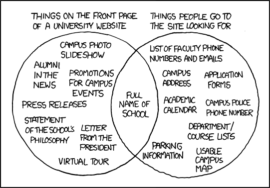
We're currently looking at making some changes to the University homepage, so today's post from xkcd is rather timely:


Hopefully we'll remember to include the things that people go looking for!

Update

A couple of higher education blogs have gone into more detail on the subject: